Evaluation – Logo (Scott)
In this assessment, we were asked to create an initial
design for a company of my own choice.
So I decided to create a logo for my clothing line. I had to take my audience in consideration
for this task. My audience is roughly my age to round about 25 years old. The
software I used first initially was Photoshop. But then my teacher said I
should broaden my horizons and learn and use a different software. So I gave
that thought into consideration and used adobe InDesign. To help me better
understand my knowledge and understanding of logos. I did some research and
compared my logos with professional logos.
I was very effective with my brief as I completed all the tasks that
was set, this included the initial stages of my idea which were required was to
establish a concept for of my digital graphic.
I had to explain my initial ideas, approaches and relevant research into
similar graphics such as Louis Vuitton which is slightly similar to my own logo
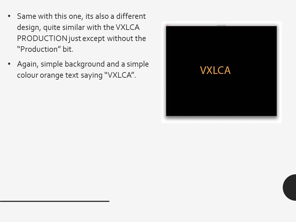
for my clothing line which is called Vxlca.
Once I have developed and established my initial concept, I am to
address the following planning and design areas as part of the planning
portfolio. I have used many appropriate
methods and techniques.
Since I have been using Photoshop, my skills and
understanding has widened a lot. I
learnt many things such as how to crop really hard pixelated images. I was also
consistent with adobe InDesign too also. At the start I was never very
confident when using adobe InDesign.
Although, there was a time when something actually went
wrong. The only thing that was a bit of a problem. This would have to be how
time consuming it was.
I have been very consistent with the use of the software.
The software I was consistent was with adobe Photoshop. This is because I am
used to using Photoshop and have used it for years and years.
Overall I would say that my level of work has been
maintained throughout. This is because again, I have been very consistent with
my work on adobe Photoshop and adobe in design. Although to be honest, there
may have been times where I haven’t maintained this level of work because I may
have had a problem, such as not knowing how to crop a certain picture properly.
 The brand that I’ve
decided to research and explain about is Louis Vuitton.
This brand has a very similar target audience to me, which is why I’ve
decided to research about it. The target audience for my product
will be for teens, male/females that like nice flashy and fashionable brands.
The age for my product would probably ideally start from quite young like 11
year olds – 20 year olds probably. Because I reckon that’s a good age range.
Their lifestyle would probably young, healthy and active. Their occupation
would vary to be honest. They could have a part
The brand that I’ve
decided to research and explain about is Louis Vuitton.
This brand has a very similar target audience to me, which is why I’ve
decided to research about it. The target audience for my product
will be for teens, male/females that like nice flashy and fashionable brands.
The age for my product would probably ideally start from quite young like 11
year olds – 20 year olds probably. Because I reckon that’s a good age range.
Their lifestyle would probably young, healthy and active. Their occupation
would vary to be honest. They could have a part  time job depending if
they’re 16 year olds +. But they obviously won’t have a part time job if
they’re under that age. So it’s pretty
much 50/50.
time job depending if
they’re 16 year olds +. But they obviously won’t have a part time job if
they’re under that age. So it’s pretty
much 50/50.
After comparing and doing a bit of my own research. This
enabled me to make my logos clothing line target audience. Because I kind of
based the logo I was researching target audience, to mine.
From time to time, I have been consistently uploading my
work to blogger. Such as the logo analysis and other tasks set from my
teacher. So I would be regularly
uploading and posting week. So that’s been about 6/7 posts overall together in
general. By doing this it enables me to gain feedback from each document. Which
will then help and better my knowledge/understanding.
In these tasks, I had to talk about and explain different
file formats in depth. Such as the Rasta file format for example. Some of the other file formats I had talked
about and explained in depth was raster and vector.
For one of my tasks I had to make a presentation about different
file formats
I had to put all these file formats onto my Prezi in order
for my teacher to mark my work and give me improvements on how to make it
better.