Wednesday, 3 February 2016

Planning portfolio - developing ideas for Digital graphic


Planning portfolio – developing ideas for Digital Graphic


Task 1 – Developing ideas for digital graphic

I am designing a logo for my client who owns a company within the fashion industry. The logo I am making is for a clothing line. The 
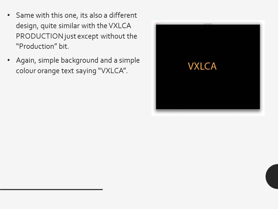
logo is a Vxlca. I did logos that were similar to mine, which helped my research.  The similar which I used to compare my own logo was Burberry London. This one was very similar because it has the image on the top and then the company name on the bottom. Likewise with my logo, the crown which is my image is on the top, then the word on the bottom which is Vxlca.


The brand that I’ve decided to research and explain about is Louis Vuitton. This brand has a very similar target audience to me, which is why I’ve decided to research about it.  The target audience for my product will be for teens, male/females that like nice flashy and fashionable brands. The age for my product would probably ideally start from quite young like 11 year olds – 20 year olds probably. Because I reckon that’s a good age range. Their lifestyle would probably young, healthy and active. Their occupation would vary to be honest. They could have a part time job depending if they’re 16 year olds +. But they obviously won’t have a part time job if they’re under that age.  So it’s pretty much 50/50


My design/layout is basically a golden yellow crown then underneath that, the logo company name written prestige saying ‘Vxlca’. So the font will probably be in the adobe family, but it will be written bold but not italic. The mode of address would probably be formal. This is because my logo is quite prestige and formal.

The address mode for logo would be formal because the logo is quite posh with a little class of elegancy at its finest.  The font itself bestows a quite posh tone and manor.

Likewise with Louis Vuitton, I would say their address mode is very the same like mine. Because their logo is very posh and elegant.

The Psychographics for my logo is upper class. This is because my brand would be high up in the table of anarchy. In addition to this, the price would be expensive.

Hence why with Louis Vuitton, it would have the same psychographics as my brand. Expensive price, high up in the table of anarchy and so on.

 The format for my logo is jpeg, this is because I have done my research and found that most if not all logo’s are jpeg format type. Plus my logo looks better and has better quality as a jpeg format type.

Planning portfolio (nature of content)


Topic
Purpose
Started – Date and Time
Date of completion
Nature of content
Initial idea development for high end fashion brand
20/01/16
 
Consideration of
audience
Researching and explaining audience of high end fashion brand (    )
27/01/16
27/01/16
Layout design
To come up with a range of ideas of my client.
20-01-16
23-01-16
Input and manipulation of images
To develop my ideas to better my product, in order to come up with a result of final product for my client
20-01-16
23-01-16
Selection of style and tone
To complete my last draw, to my final ideas.
20-01-16
21-01-16


Wednesday, 21 October 2015

Logo analysis

Logo Research – Victor Ladoja

·         Decide on what type of graphic you want to design
·         Identify the media sector you would design this for (moving image, print, interactive, combination)
·         Discuss and explain the audience/s for your product.
·         Start with initial sketches and ideas. Scan or photograph sketches for this
·         Plan using a range of applications and the formats for your graphic/logs


The type of graphic I would like to design is a logo, because im used to making logos and think as i have experience in making logos it'll be easier to create. Rather than creating something different whereby i dont have any experience in.


 The media sector I will design this for is a clothing line. A clothing line suits my sector because the logos i am creating look like they should be on clothes. The logos are very creative yet basic and very clothing line worthy.


The audience for my product will be teenagers just like me, aged 13-19 years old. This is a very beneficial audience range


This is the 1st logo I made on Photoshop, I think it looks very good and professional and would be very appropriate in the business/media industry.


Over here is the second image that I also created on Photoshop, which is a bit different to the 1st logo I created. I also think that this one is very good because it may look a bit simple but looks professional at the same time.


Finally this is my 3rd product I created on Photoshop. This one is very creative with the crown and my product name. My logo will be targeted at 11 year olds – 20 years old. 


The software I’ll be using is adobe Photoshop because I’m used to using Photoshop and very experienced.  I will have a range of fonts because a variety of fonts is very beneficial. 
Unit 54 - Digital Graphics for print

We are going to produce a digital graphic logo for print base.
1.      Semiotics – Anchorage
2.      Denotation – What you actually see. What is signified
3.      Connotation – What it represents and suggest and what message is giving off.
4.       


FedEx: Federal Express - Delivery/courier. The F and the E are capitals. The rest are lower case. Two different primary colours, orange and purple. Purple suggest royalty. Orange suggest
Its global, formal and institution. The arrow suggest moving to the              Future and delivering parcels.


Baskin Robbins: The 31 suggest 31 different flavours Whilst it says 31 It still spells out BR which is an abbreviation for baskin Robbins. Again the name is lower case which shows simplicity and its basicness. There are two main primary colours which are blue and pink. Blue suggests and purple suggest. The layout is very creative and quite unique.


This logo suggest they can deliver anything from a – z, meaning any products from a-z. Also there
is a smiley face. So it’s a arrow from a – z plus a smiley face. Suggesting they’ll deliver the customers product which is from a – z with a smile on their face (happy service).

Choose 4 logo/graphics
1. Discuss Semiotics and Explain
2. Analysis of text, colour, image and layout.
3. Identify and explain target audience through your analysis and how it appeals


Logo Analysis
Toblerone: Toblerone is a chocolate bar. The Toblerone brand comes from Bern in the Switzerland – which is also known as ‘The City of the bears’.  If you look closely, you can see a white bear in the background and there’s a mountain in the background.  The target audience for this would be children and adults that like chocolate. The 3 main colours being used are red, white and goldish/yellow. Red suggests love, power, desire and energy. White suggest cleanliness and goodness. Gold suggests cheerfulness, happiness and joyfulness. The logo itself is very creative and quite artistic.

LG: LG stands for Life is good. If you tilt the logo shape around and connect the line with the other line, you can see a smiley face which represents life is good. The target audience for this one is very quiet different. I would say the target audience for LG would be from teenagers to adults only. Little children or the very elderly wouldn’t really buy from LG as they wouldn’t really know how to use them. With the text in this logo are in capitals. This makes it more eye appealing and eye catching because it stands out with its boldness. In this logo there are colours which are pink, grey and white. Pink suggest power, energy and royalty. White suggest cleanliness and goodness. Grey suggests dullness and plainness.
Burger king: In the actual logo there is a burger and inside of the burger says Burger King and then you got the buns on the top and the bottom. The target audience for this really is anyone who eats burgers. So again it’s a wide range from children to adults/elderly. The text in this one is quite unique because both of the words are in capitals but the ‘burger’ is smaller than the ‘king’ bit. So this makes the ‘King’ bit stand out as it’s bigger and bolder. The design and layout again is very creative. There are 3 colours being used which are blue, gold/yellowish, and lastly red. These are 3 very powerful colours which have many meanings. Blue suggests confidence and loyalty. Gold suggests cheerfulness, happiness and joyfulness. Lastly red suggests love, power, desire and energy. So all these 3 colours make the logo much more powerful and creative as it has a lot of background meanings.


Specsavers: There are two lens glasses surrounded by the word so it’s representing glasses which is what they sell, the target audience for Specsavers is quite self-explanatory, it’s for people who need glasses/contact
lenses. So the target audience could be from anywhere from young children to elderly people. So it’s quite a big target audience. The font is quite simplistic, nothing fancy. There are only two colours being used which are green and white. Green suggest power, growth and freshness. White suggest cleanliness and goodness. It appeals because it’s very eye-catching and noticeable.
Coke: Its rare, but hidden messages can be sometimes be a complete coincidence! A Danish flag can be spotted in the negative space between the ‘o’ and the ‘L’, and Coca-Cola used this to their advertising in Denmark. The target audience for coke is mostly for children, teenagers and adults that generally like to drink coke. Red suggests love, power, desire and energy. White suggest cleanliness and goodness.  The round circle in the background is quite basic but then there’s the white bit with fancy writing.


File formats
JPG - Joint Photographic Group (pronounced 'Jay peg')
The JPG is probably the most common file format now in use for storing digital images, especially on the web. It is ideal for images that use more than 256 colours, such as digital photographs.

GIF - Graphics Interchange Format (pronounced 'giff')
Like the JPG, the GIF file format is commonly used on the web. It is ideal for images that have large blocks of a single colour, and it can support up to a maximum of 256 colours. Unlike with JPGs, it is possible to alter the background colour of a GIF to make it transparent. This makes it possible to place it over other images or on webpages.
BMP - Bit-mapped
This is an appropriate file format for Windows users. It is used for general storage purposes - such as when images are awaiting editing - or as wallpaper for a Windows desktop. BMPs aren't really suitable for Macintosh computers or the web. BMP images are large files that require a lot of storage space because no effort is made to reduce the file size.

Graphics packages allow the user to save their work in compatible file formats that can be used in a variety of software programs - e.g. .jpg, .gif, .tiff.
Print: The following applications that I would use to design a print image would be adobe Photoshop, flash, illustrator. The file for a print would be jpeg  

Moving image: The following applications that I would use to design a moving image would be adobe premiere pro, Sony Vegas pro.

Interactive: The following applications that I would use to design an interactive product would be